Without further ado, The Quidditch Post is thrilled to announce the winners of its worldwide uniform contest. Teams, players, and spectators were given one week to submit the jersey/kit of their chosen team. After voting ended on Nov. 5, we tallied up and announced the winners of the popular vote, which was determined by counting the number of unique likes on each individual team’s Facebook album and photos. The popular vote determined the Belgian Gryffins to be first, followed by the Hofstra Flying Dutchmen, U of C Mudbloods, Toulouse Quidditch, and the Black Snitches.
Our judges—Andy Marmer, managing editor of the Quidditch Post; Kym Couch, USQ Northwest regional director; and Emily Crouch, USQ copy editor—then ranked each team based on originality, design, team representation, and affect. We averaged the judges’ scores for each individual team and ranked each team, 1-22. Next, we ranked each team by the popular vote, 1-22. Finally, we averaged the two scores. In the case of a tie, we brought in an impartial fourth judge to determine the winner. You can find the descriptions and explanations for the top five teams below, as well as a table of the final rankings. Be sure to keep an eye out for our next contest!

Andy Marmer: I can't decide whether I love these jerseys or not. The logo on the front—a centaur and the Toronto skyline—is very well done. I really love the lettering as well. I'm not really sure about the choice of featuring a snitch so prominently though. I think it takes away from features such as the skyline, which would enhance the jersey. The blue-on-blue color scheme on the back is something that I like in theory, but in reality it just doesn't wow me. I think it makes things too hard to read, and the font on the back doesn't help.
Score: Originality 4, Design 4, Team Representation 5, Affect 3
Kym Couch: I love this design. I love everything about it. It is smart, simple, and the logo design is VERY strong. I only marked down for affect because of some unknown dislike that I have that I cannot even pinpoint, but it's so minor it's only worth one point.
Score: Originality 5, Design 5, Team Representation 5, Affect 4
Emily Crouch: This is definitely unique to the U of T squad, but that's about it. There's a TON going on, and the rest of the jersey just exists instead of being pulled together by a design.
Score: Originality 5, Design 3, Team Representation 5, Affect 2
Votes: 102
Vote Ranking: 8th
Judges Score: 4.17
Judges Ranking: 4th (Tie)
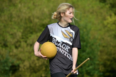
Andy: A nicely done jersey that seems to epitomize the team well. I really like the overlay of the white text on a black jersey. The diagonal aspect of the entire jersey is a bit off-putting for me.
Score: Originality 5, Design 3, Team Representation 5, Affect 4
Kym: I really like these jerseys as well. The snitch is well-designed, the tearing design is very original, and the team representation is spot on. I know who this team is and what their name is without question. The only thing is, do they have a logo? If not, fine, but if so, I would like to see it somewhere. I would generally like something on the sleeves as well, even if it was just a yellow or white line along the bottom; just something so it doesn't feel so empty.
Score: Originality 5, Design 4, Team Representation 5, Affect 4
Emily: There's no mistaking what team you're on with these jerseys! I love the sleek black and white design, but the font, large snitch, and the graphics on the front make it very busy and distracting.
Score: Originality 4, Design 3, Team Representation 5, Affect 2
Votes: 139
Vote Ranking: 5th
Judges Score: 4.08
Judge Ranking: 6th (Tie)
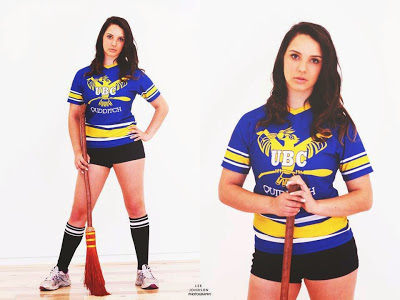 |
Photo by Lee Johnson Photography
|
Andy: The Thunderbird looks a little rough on the front; it’s not nearly as polished as it seems to be. I also feel like the lettering should take up more space, which is admittedly a bit tough when you only have three letters to work with. Everything about the colors and stripes on this jersey is very well done. The blue and gold combine well. and the stripes on the sleeves and bottom keep it from being boring.
Score: Originality 3, Design 4, Team Representation 5, Affect 3
Kym: I love these. I have seen them up close and, although I was not a fan at first, they really hold up well. The only thing I don't like is that there is a white font on a yellow design. That is a terrible design choice, but I voted it down on team representation because it just makes "UBC" hard to see, but doesn't affect the overall feel.
Score: Originality 3, Design 4, Team Representation 4, Affect 5
Emily: This one stood out to me when looking at the submissions. It's a great classic uniform look but with UBC's own twist. It's not boring to look at and isn't plain. The only issue I foresee is the readability on the front crest.
Score: Originality 5, Design 4, Team Representation 4, Affect 5
Votes: 113
Vote Ranking: 6th
Judges Score: 4.17
Judges Ranking: 4th (Tied)
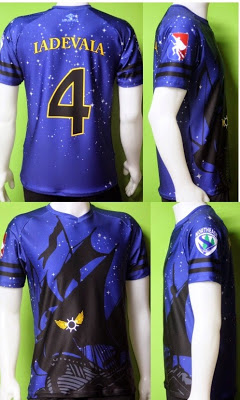
Andy: The design and colors on these really pop. The gold lettering is great and the "stars" stand out. I love the midnight mixture of dark blue and black. The ship is a little big on the front and the snitch is a bit over complicated for my taste.
Score: Originality 5, Design 5, Team Representation 3, Affect 3,
Kym:All that got marked down on this jersey was that the contrast for the ship with the jersey color is really not there. It's very hard to see the ship, so from a distance, it just looks like a jersey with stars and you can't see the boat. If there was, for example, a moon or something that made the jersey color directly behind the ship a little lighter, that would have enhanced it enough for a perfect score. The curved name is not my favorite, but I have no design quarrels with it; I just don't like curved words unless they surround something.
Score: Originality 5, Design 4, Team Representation 5, Affect 4
Emily: This is a stellar design—a huge step up from their old kit. The Dutchmen took the design and ran with it to great success. It's really easy to look at individually and as a group. The colors aren't overwhelming, and the subtle snitch from the cannon blast is smart. The only thing I would fix is the brightness of the jersey. It's very dark, and the front design is a bit difficult to make out sometimes.
Score: Originality 5, Design 5, Team Representation 4, Affect 4
Votes: 299
Votes Ranking: 2nd
Judge Score: 4.33
Judge Ranking: 2nd (Tied)

Andy: I love just about everything about this jersey. The color scheme is perfect. The text is easy to read. The flag and number on the jersey as well as the logo really bring it together. The claw was an element that took me a minute to pick up on, but overall it’s very well-designed and executed.
Score: Originality 4, Design 5, Team Representation 5, Affect 5
Kym: There is nothing I don't like about this uniform. The color choices, design, and composition are brilliant. I love the outline on the numbers, and there is even strong team representation with the nice big gryffin arm. The claw is a very original choice. Love it. The only thing I would change is the yellow on the top of the griffin arm. It's a weird shape, and it's a bit confusing and distracting up close. It doesn't take away from the jersey as a whole, but I did mark it down a little in design because it is supposed to look like fur, but that long curl is a really weird design choice that just looks very off.
Score: Originality 5, Design 4, Team Representation 5, Affect 5
Emily: I love the originality of this jersey. The subtle griffin claw over the shoulder is a nice nod to the name. It's easy to read and very clean. Definitely a great looking kit.
Score: Originality 5, Design 4, Team Representation 5, Affect 4
Votes: 317
Voting Rank: 1
Judges: 4.67
Judges Rank: 1 (All judges ranked this as their top choice)
THE BELGIAN GRYFFINS HAVE THE WORLD’S BEST QUIDDITCH JERSEYS!!!
Here are the final rankings:
Belgian Gryffins
|
1
|
Hofstra Flying Dutchmen
|
2
|
UBC
|
3
|
Black Snitches
|
4
|
U of T Centaurs
|
5
|
Monash Muggles
|
6
|
Team Mexico
|
7
|
Badassilisks
|
8
|
U of C Mudbloods
|
9
|
University of Richmond
|
10
|
Lonestar Quidditch Club
|
11
|
Toulouse Quidditch
|
12
|
Green-Tauros Torino Quidditch
|
13
|
London Unspeakables
|
14
|
The Santa Barbara Blacktips
|
15
|
Kansas Quidditch
|
16
|
Toledo Quidditch
|
17
|
QC Carolinas
|
18
|
Reading Rocs
|
19
|
The Warriors
|
20
|
USC Quidditch
|
21
|
Barcelona Eagles
|
22
|
No comments:
Post a Comment